
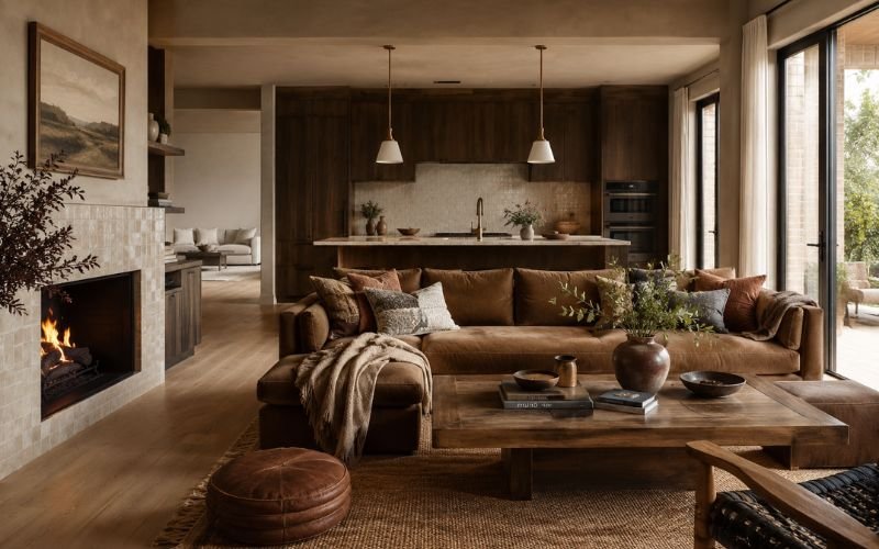
For years, home brands had a safe answer for almost everything: make it neutral.
The sofa became gray. The rug became beige. The paint became off-white. The candle jar became cream with a tidy serif label. The bedding became “natural.” The shelf became polite, quiet, and very easy to compare.
That last part is the problem.
In home improvement, décor, paint, lighting, and renovation products, the neutral middle used to feel like the least risky place to sit. It helped brands avoid strong reactions and gave shoppers something easy to live with.
But in 2026, the brands protecting margin are not the ones sitting in the middle. They are using warmer, richer, more specific palettes and styling.
That is why more home and renovation companies are paying attention to studios focused on brand identity and positioning. When a category is crowded, the difference between “another beige chair” and “the chair that completes a warm, lived-in room” can affect how much a shopper is willing to pay.
Paint trends make the pattern easy to see. Sherwin-Williams named Universal Khaki SW 6150 its 2026 Color of the Year, while Benjamin Moore chose Silhouette AF-655, a deeper shade with burnt umber and charcoal notes. Pantone’s 2026 Color of the Year, Cloud Dancer, is technically white, but it is framed around calm and softness rather than blank minimalism.
Neutral has not disappeared. The vague middle has.
Safe Neutral Started to Look Too Cheap
Neutrals made sense for the home category. People have to live with paint, flooring, lamps, storage, and tiles long after they buy them.
The trouble is that online shopping flattened the category. On marketplaces and DTC sites, one beige chair sits beside another. One “modern farmhouse” wall light looks almost identical to the next. One brushed brass tap can be compared by price, review count, delivery speed, and return policy within seconds.
When everything looks broadly tasteful, the buyer has little reason to pay more.
That is where the neutral middle starts damaging margin. It makes a product easy to swap. If a customer cannot feel the difference between one linen cushion and the next, price becomes the loudest part of the page.
The brands doing better in 2026 are not abandoning restraint. They are giving restraint a sharper identity. “Warm clay” feels different from beige. “Espresso brown” feels different from dark neutral. “Mushroom,” “sage,” “khaki,” “ochre,” and “rust” give the customer a room to imagine, not just a product to compare.
Houzz’s 2026 summer trend coverage points in the same direction, with homeowners leaning into earthy palettes, textured finishes, and cozy, old-world interiors rather than colder minimalist rooms. The report highlights growing interest in rust, chocolate brown, sage, taupe, mushroom, limewash, Venetian plaster, sandstone, and terracotta.
Those are not random color names: they are emotional shortcuts.
A homeowner does not search for rust tones because they want something invisible. They search because they want warmth, age, character, and a room that feels less like a showroom.
The New Neutral Has a Point of View
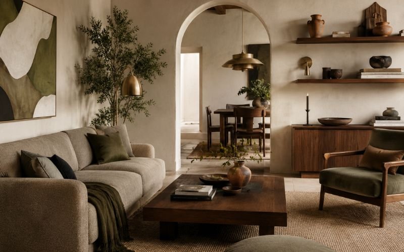
Universal Khaki is still a neutral. Cloud Dancer is still white. Cream, taupe, mushroom, and sage are hardly dramatic colors. But they are not blank. They suggest texture, material, and mood.
A white wall can feel clinical. A soft white can feel calm. A beige sofa can feel like a compromise. A mushroom-toned sofa can feel designed. A brown cabinet can feel heavy. An espresso or burnt umber cabinet can feel architectural.
The difference is small in color terms, but large in buying terms.
Home shoppers often want reassurance and personality at the same time. They do not want to make an expensive mistake, but they also do not want their home to look like every rental flat on the internet. The new neutral gives them a safe base with enough taste signal to make the choice feel personal.
This is why brand language matters as much as the palette.
A paint company selling “brown paint” has to work harder than one selling a deep, tailored shade with styling notes for limewash walls, walnut furniture, and warm metal fittings. A tile brand selling “cream tiles” has less room to hold price than one showing how a handmade cream zellige works in a small kitchen, a bathroom niche, or a fireplace surround.
In a crowded home category, the product page has to do more than list dimensions, materials, and delivery terms. It has to help the buyer understand where the item belongs, what kind of room it creates, and why this version feels more considered than the cheaper one sitting beside it.
Even practical products benefit from sharper context.
This is the difference between a product and a reason to buy.
Margin Is Protected Before Checkout
Home brands often talk about margin as if it only happens inside operations. Cost of goods, freight, paid media, returns, fulfillment, and discounting all matter. A better shade name will not fix a weak business model.
But margin is also shaped earlier, at the point where the customer decides what kind of product they think they are looking at.
A plain storage basket competes on size and price. A woven basket styled for a warm hallway or utility room has more room to feel considered.
The point is to help buyers understand why one product belongs in their home more than another.
That is where many home brands lose money. They spend on product design, photography, packaging, and ads, then describe the product as if it has no world around it.
“Neutral,” “modern,” “premium,” and “timeless” are weak on their own now. They have been used so often that they barely mean anything. The brands holding margin are getting more exact.
They are saying warm, tailored, earthy, soft, mineral, vintage, smoked, plastered, brushed, aged, or sun-washed. They are building palettes that feel like real homes.
What Home Brands Should Take From 2026 Color Trends
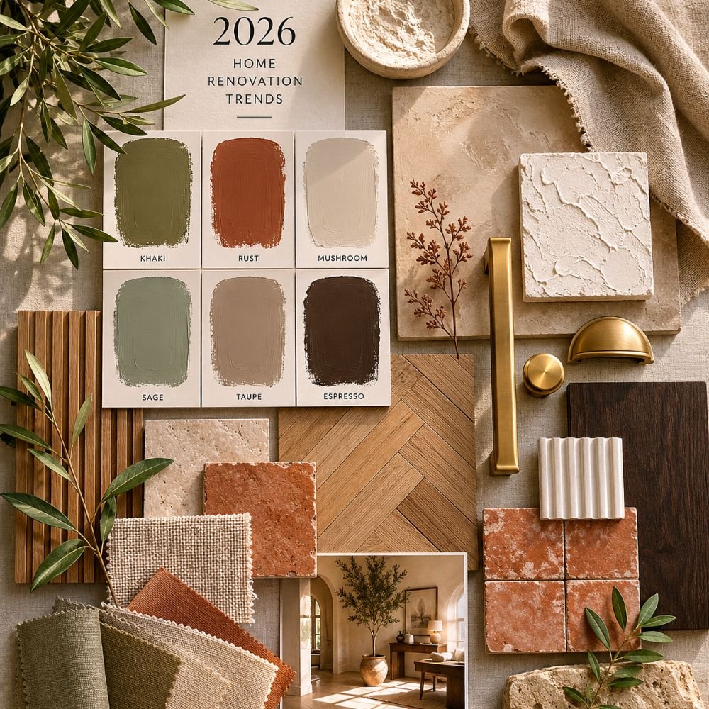
For home improvement and renovation brands, the lesson is not to use brown everywhere. Shoppers still want livable choices, but they want those choices to carry taste, warmth, and a reason to exist.
Paint brands understand this better than almost anyone because they sell emotion through small differences. A customer may stand in front of 40 shades that look almost the same to everyone else, but one shade will feel right because of the story around it, the undertone, the name, the styling, and the way it appears in a real room.
Flooring brands can move beyond “light oak” and show the difference between coastal pale wood, honeyed oak, smoked oak, and aged natural finishes. Lighting brands can stop relying on “brass” and start showing how warm metal changes a hallway, vanity area, or kitchen island. Garden brands can sell planters, outdoor furniture, and fencing through mood and material, not just dimensions.
This also matters for renovation suppliers. Roofing, flooring, doors, hardware, and construction materials are practical purchases, but customers still want the finished home to feel like something. Even a small detail, such as the finish of a door handle or the warmth of a floor stain, can affect how confident someone feels about paying more.
For brands that have lived in the safe middle for too long, this is often not a product problem. It is a positioning problem.
The job is not to make every brand louder. It is to make the value easier to see.
The Middle Is Still Crowded
The neutral middle will not vanish. There will always be a market for white paint, beige sofas, gray flooring, and simple storage. Plenty of homeowners still want calm, flexible rooms. Plenty of landlords and renovators still need safe finishes that appeal to the widest number of people.
But “safe” and “same” are drifting further apart.
A home product can be calm without being forgettable. It can be neutral without being vague. It can be practical without looking like it came from the same supplier as everything else on the page.
The winners are not necessarily the boldest. They are the ones that know exactly what kind of quiet they are selling.
A khaki wall. A chocolate-brown cabinet. A mushroom linen curtain. A cream tile with uneven edges. A soft white room that feels warm instead of empty.
These are still livable choices. They just have a pulse. In a category where price comparison is brutal, that small pulse can be the difference between holding margin and discounting by Friday.


